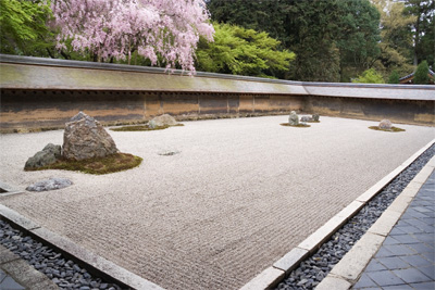
Rock gardening
 This might not mean much to people whose idea of fun is ziplining or parasailing, but I do so enjoy page design. The very quiet, contemplative exercise of finding balance among shapes and colors. Like Japanese rock gardening, or like I imagine it to be, but I’ve never Japanese rock gardened, so I could have that wrong.
I do know web design, however,and can say without fear of contradiction that it’s a far cry from page design. If page design is like rock gardening, then web design is like hockey. Of course, I’ve never played hockey, so I could have that wrong, too.
When the press delivers a print job, the job is done. It’s solid. Literally and figuratively. Pull it out of the sample drawer years or decades later and it will look and works just as it did the day it was printed.
Websites, on the other hand, especially database-driven websites (which is what all self-respecting websites are these days), don’t age worth a damn. Links break, code becomes deprecated, best practices appear, mature and fall out of favor in the blink of an eye. As software development cycles shorten, bandwidth increases and new functionalities are rolled out one on top of the other, the term “cutting edge” becomes almost meaningless.
Again say I therefore that web design is a young man’s game. Like hockey. I think. It certainly isn’t a thing done at one’s leisure, carefully raking the rocks into parallel lines.