Brand new
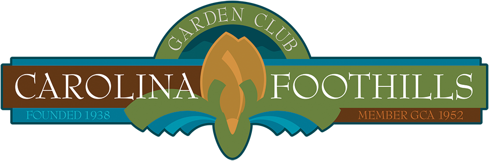
The branding makeover for Carolina Foothills Garden Club that I mentioned in July is nearly complete. All that’s left is for the Club’s general membership to bless what its marketing liaisons have approved, and when that’s done, we’ll incorporate the new brand into an interpretive sign concept for Falls Park. That concept will be included in a grant proposal the Club is writing to cover the cost of fabricating the signs, quantity to be determined.
When funding has been secured, the first sign will be erected in an obscure but notable cul-de-sac located behind the park’s circular stage, an area called the Reflection Garden, about the size of an average suburban back yard. Its main feature, other than the rocky stream that flows beside it and the lush embankments that surround it, is the 19th century spring house where Furman University stored milk and dairy products before God created freon. By the time Furman relocated ten miles closer to California in 1953, the spring house was being used to store plants.
Depending on funding and municipal cooperation, we might go on to design signs for the entire park, dozens of them, etched in metal and consistent in manufacture with existing signage and, one would hope, equally immune to vandalism. Maybe it’s the curfew, or the cameras, or the occasional displays of military might, but Falls Park is remarkably graffiti-free.
September 9 update: The Garden Club has REJECTED this design. Emphatically. Too busy, hard to read, poor choice of colors. Back to the drawing board one last time.